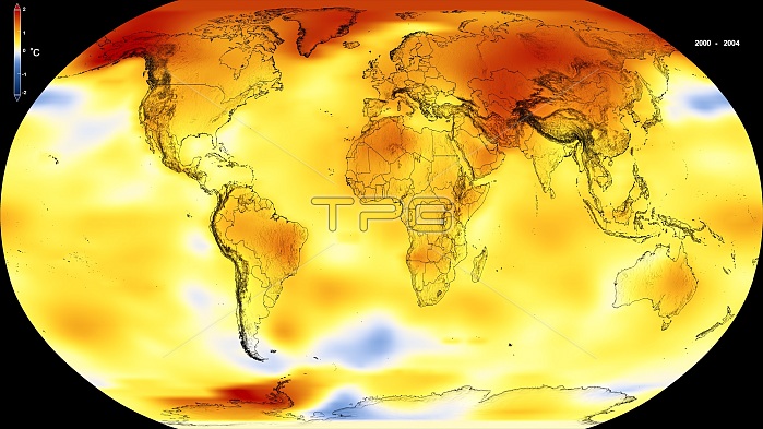
Global warming record. Global map of surface temperature anomalies for the period 2000 to 2004. This is part of a sequence showing the trend of global warming from 1880 to 2018. Recent years have seen the warmest years since modern records began in 1880. This map shows where Earth's surface was warmer or cooler in the daytime than the average temperatures. Red is warmer than average, white is normal, and blue is cooler than average. The maps use the Robinson projection and the NASA Goddard Institute for Space Studies (GISS) Surface Temperature Analysis dataset (GISTEMP). For the full sequence of 12 images, see images C046/8745 to C046/8756.
| px | px | dpi | = | cm | x | cm | = | MB |
Details
Creative#:
TOP24869259
Source:
達志影像
Authorization Type:
RM
Release Information:
須由TPG 完整授權
Model Release:
N/A
Property Release:
N/A
Right to Privacy:
No
Same folder images:

 Loading